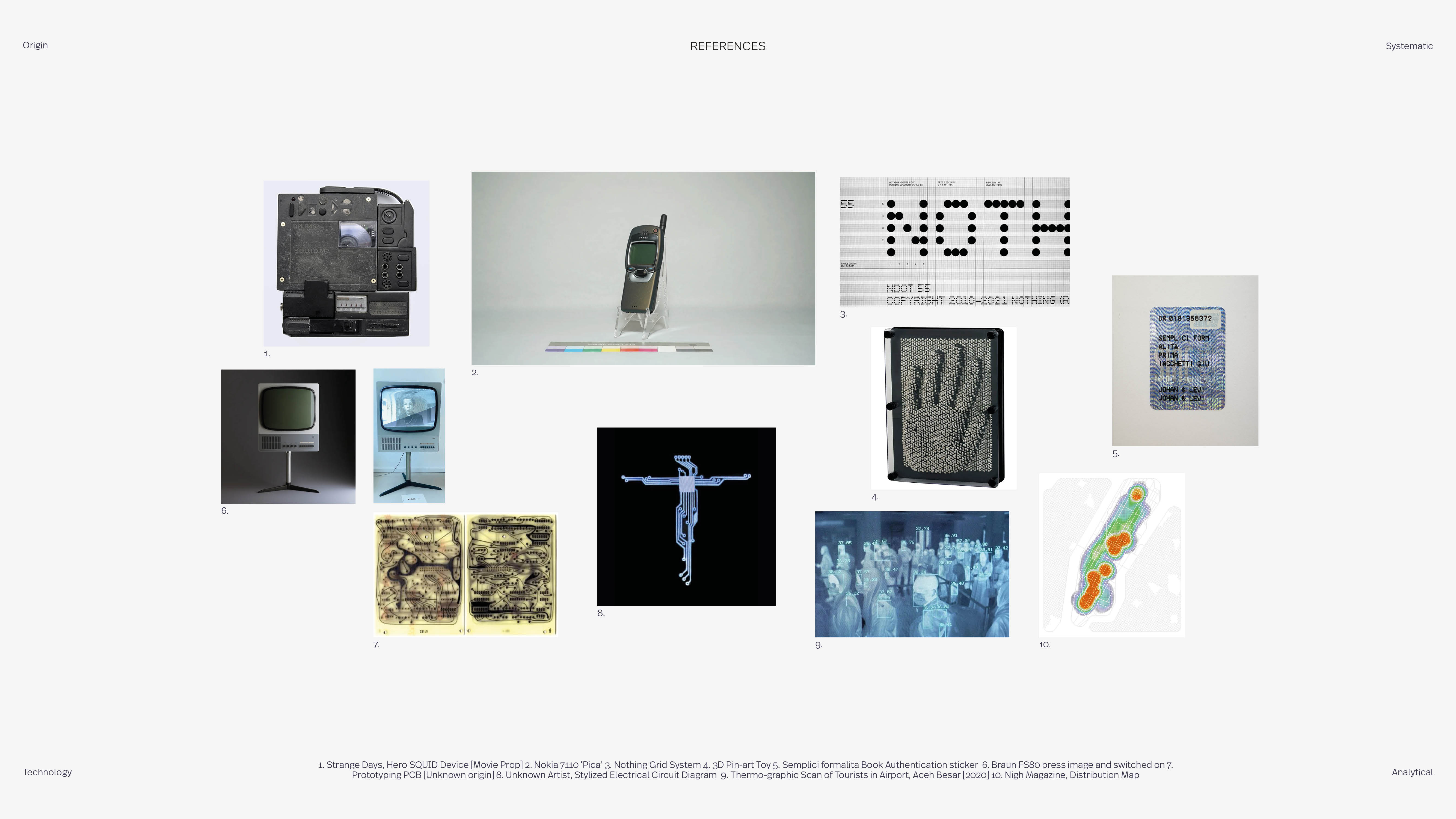
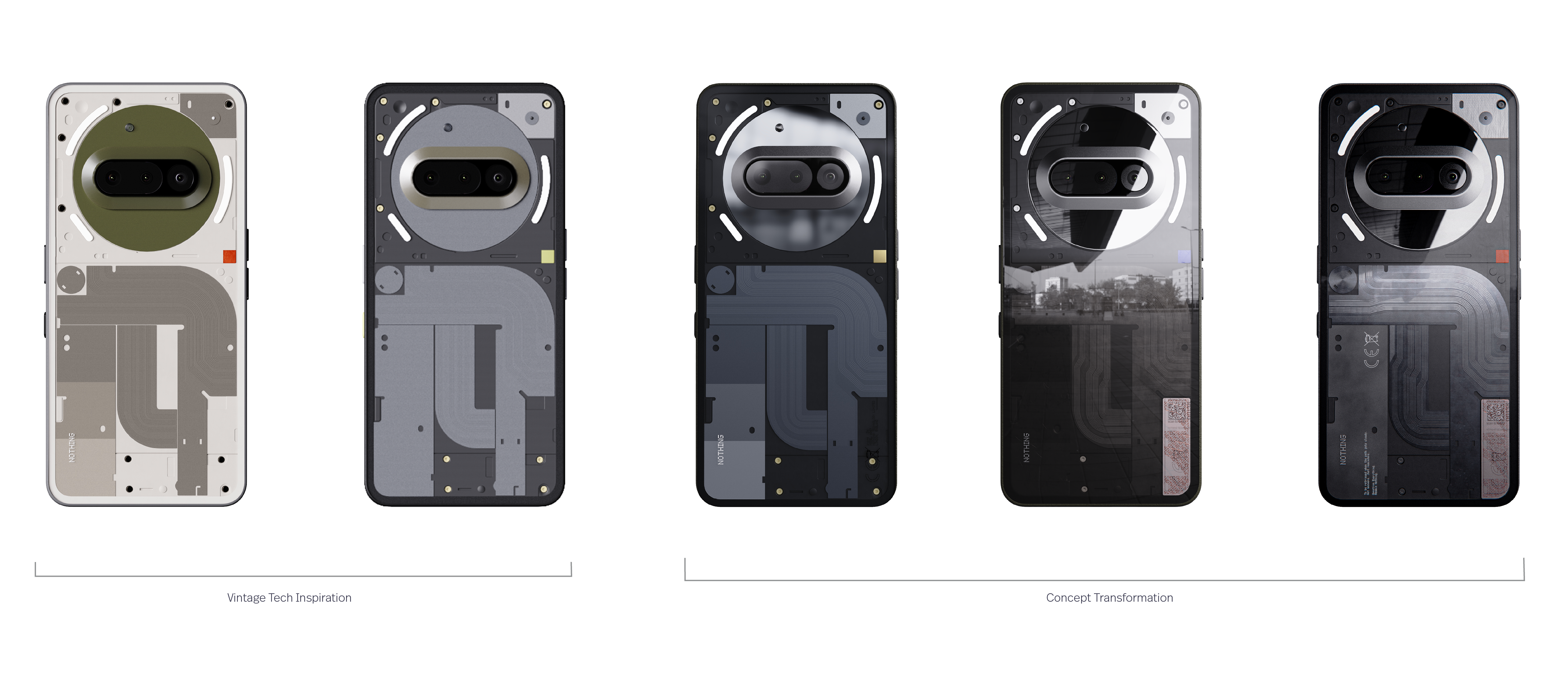
For my Nothing Phone (3a) Community Edition submission, I explored how the clear-back identity could move beyond aesthetics into meaning. Nothing phones have always felt like museum cases - transparent shells separating the world from the circuitry and ideas beneath. I began treating that space as a time capsule, holding a snapshot of who Nothing is today: its quirks, community, and core values.
The concept becomes less about decoration and more about memory, using transparency, reflection, exposure, and concealment to ask: what parts of our tech are worth preserving for the future?
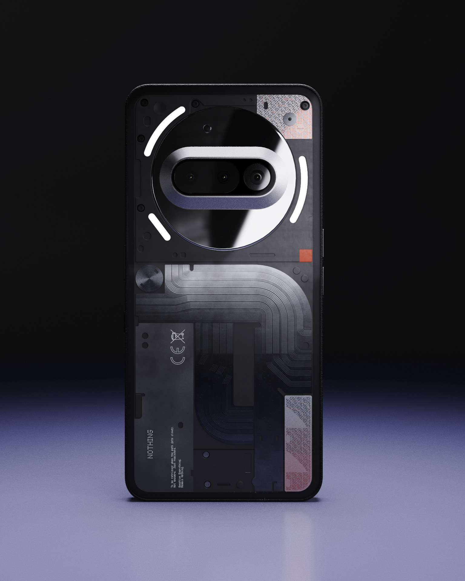
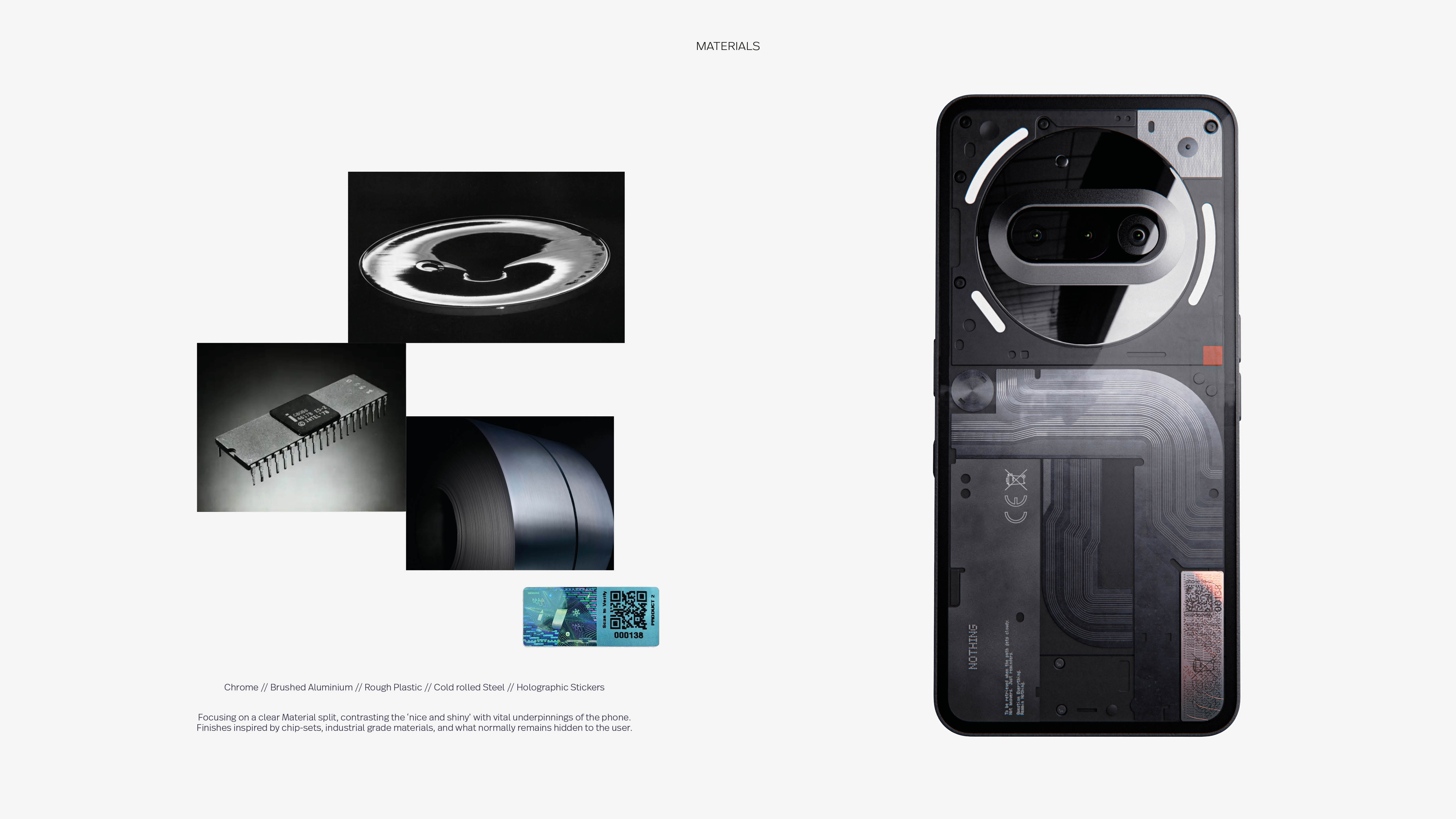
The design splits the phone into two emotional layers. The top half carries that clean, reflective expectation we all have of our devices — the part that feels almost self-aware when you catch your own reflection in it. The lower half flips the script. Instead of hiding the “undesirable” bits, it brings them forward: rolled steel textures, exposed chip-die references, and product labels placed with intent rather than obligation. It’s the infrastructure of the phone, made honest.
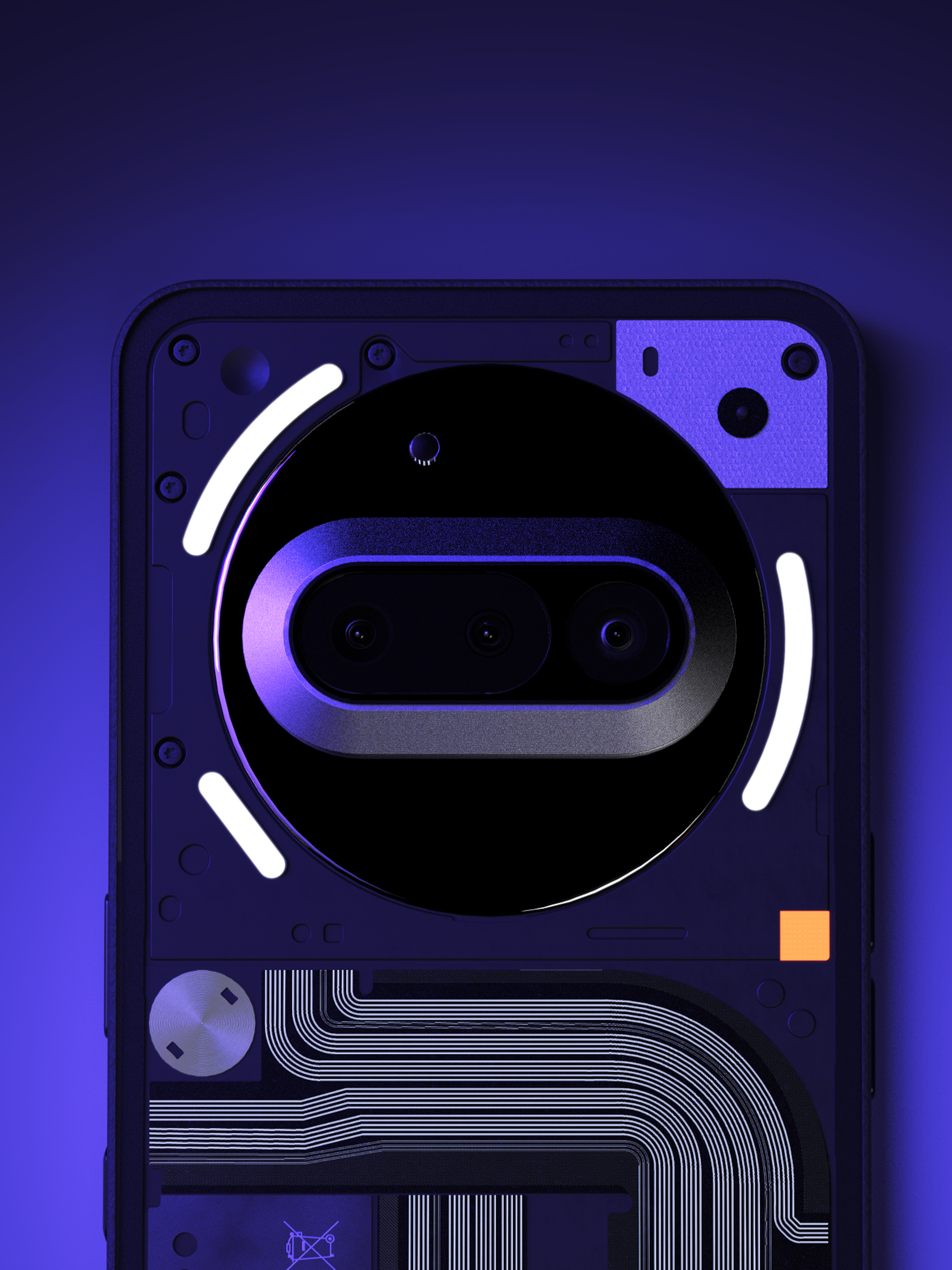
Under UV light, the whole thing shifts. The internal pathways light up like the phone’s veins, and Nothing’s red square becomes more vivid and electric. It’s a small moment, but it reinforces the idea that tech carries stories - some visible, some waiting for the right conditions to appear.